Most startups under $5M in annual revenue do not need a business intelligence (BI) platform yet. (For subscription businesses, read "$5M" as $5M ARR, or annual recurring revenue.) They need BI when reporting becomes recurring, multi-source, team-wide, and slow enough to affect decisions. Before that point, a well-maintained spreadsheet outperforms any dashboard nobody logs into.
The harder question is timing. Buy too early and you pay for software your team ignores. Buy too late and your ops lead spends every Friday afternoon rebuilding the same report from five browser tabs. A practical framework can help you figure out which side of that line you're on right now.
Key takeaways
- Most startups don't need BI software yet. Businesses below roughly $3M in annual revenue typically get more value from well-maintained spreadsheets than investing in a business intelligence platform. The biggest exceptions are companies managing four or more data sources with recurring reporting needs across multiple team members.
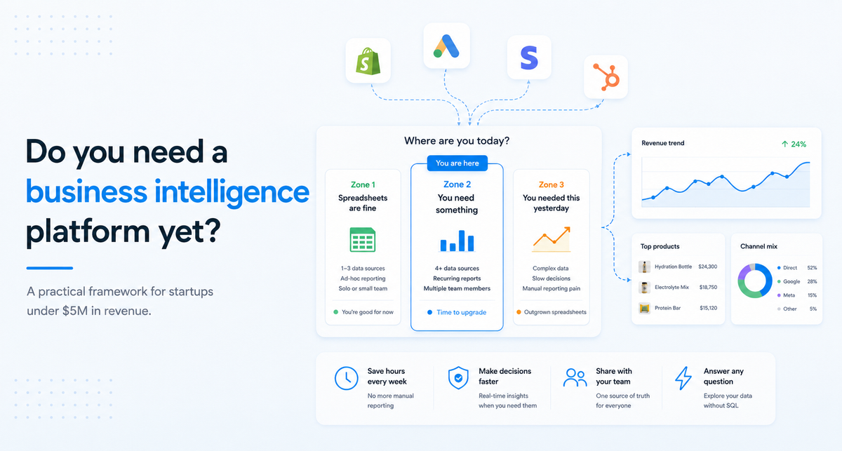
- There are three clear stages of analytics maturity. Rather than a simple yes-or-no decision, most businesses fall into one of three readiness zones: spreadsheets are still enough, you need a connected analytics tool, or you've already outgrown manual reporting. Your stage depends on factors like data source count, question frequency, team size, data literacy, and how quickly decisions need to be made.
- The right analytics tool depends on your current stage. Spreadsheets, connected-answer platforms that let you ask questions in plain English, and full BI platforms each solve different problems. Choosing the right solution is less about company size and more about the complexity of your data and decision-making needs.
Three zones, not a binary decision
A yes-or-no answer to "do we need BI?" misses the middle ground where most growing startups actually sit. A three-zone model maps more closely to how data needs evolve as a company scales from founder-led to team-driven operations.
As a rule of thumb, if three or more criteria land in Zone 2 or Zone 3, you have outgrown your current setup. The rest of this article walks through each criterion so you can place yourself accurately.
How many data sources feed your weekly reporting?
Fewer than three data sources is a spreadsheet problem, not a BI problem. A founder pulling revenue from Stripe and expenses from QuickBooks can track both in a single Google Sheet with a consistent Monday-morning update cadence. Total cost: free. Total time: 30 minutes per week.
Three to five sources is where friction compounds. You're exporting CSVs from Shopify, copying numbers from QuickBooks, pulling ad spend from Google Ads, and pasting everything into a shared spreadsheet. Manual reconciliation eats an hour or more per reporting cycle. Errors accumulate. As a rule of thumb, once you're spending more time assembling data than reading it, the assembly step is the bottleneck.
Six or more sources is a structural problem. Revenue across two billing systems, product usage in one tool, marketing performance in another, expenses in a fifth, customer data in a sixth. No single spreadsheet can hold a reliable picture, and the manual update cycle takes so long that the numbers are stale by the time anyone reads them. Infrastructure costs compound here, too. Before you've built a single dashboard, a full modern data stack (data warehouse, ETL pipelines, and a BI layer) can run $2,000 to $5,000 per month in infrastructure alone, according to Definite.app (2026). That estimate covers warehouse, pipeline, and tooling costs for a multi-source setup and comes from a vendor with a commercial interest in the comparison. Simpler setups with fewer sources cost less.
Self-assessment cue: Count the browser tabs you open on Monday morning to understand how the business is doing. If the count exceeds four, you're past the spreadsheet ceiling for most startups at this stage.
How often does your team ask the same data questions?
Monthly or ad hoc questions don't justify automation. If your ops lead asks "what was last week's revenue?" once a month, pulling the number from Stripe takes two minutes. No tool needed.
Weekly recurring questions shift the math. When the same report gets built every Monday, every board prep, and every sprint review, the cumulative time cost starts to justify a connected view that refreshes on its own. If your ops lead spends three hours every Friday assembling a board deck from four tabs, the yearly cost is over 150 hours of reporting labor. A simple weekly dashboard that auto-refreshes can pay for itself within a few cycles at that frequency.
Daily recurring questions mean the spreadsheet ceiling is already behind you. If someone spends 30 minutes every morning pulling the same numbers, the total is 10 hours a month on data assembly instead of analysis. At daily frequency, the question shifts from "do we need a tool?" to "how much is the delay costing us in slower decisions?"
Self-assessment cue: Track how often the same data question comes up in Slack or standup for two weeks. If any question recurs more than twice a week, as a rule of thumb, it's a candidate for automation.
How many people need access to the same answers?
A single founder pulling data for personal decisions can work in spreadsheets indefinitely. The file lives in one place. One person owns it. Version control is irrelevant because there is only one version.
Three to ten people needing the same data creates governance problems. Someone emails a spreadsheet. Someone else edits the shared-drive copy. A third person screenshots a number from last Tuesday's version. By the time these reach a meeting, nobody is sure which figure is current. Collaborative spreadsheets break down over ownership, not access. Google Sheets handles concurrent editing. The problem is unclear metric definitions, competing copies, stale screenshots pasted into decks, and no single place where "the number" lives.
Ten or more people needing regular data access means your reporting capacity is the bottleneck, not your tool. One Reddit user described a 250-employee manufacturer with just two IT staff trying to move from Excel to BI (2024). Dozens of people needed answers and only two people could produce them. When access demand outstrips the one or two people who maintain the data, you have a staffing-shaped problem that only a self-serve tool can fix.
Self-assessment cue: Count how many people asked you or your ops lead a data question in the last month. If it's more than five, your current setup is creating a bottleneck for most teams at this size.
What does your team's data literacy actually look like?
Low data literacy does not automatically rule out analytics tools, but the reason behind the gap matters. Two distinct situations look similar on the surface but require different responses.
The first situation: the team doesn't know which business metrics matter. Revenue, churn, customer acquisition cost, gross margin: if these terms don't have agreed-on definitions in your company, no tool will fix that gap. Define the five to seven numbers your business runs on before buying software. A template spreadsheet with those metrics, updated weekly by one person, is the right starting point.
The second situation: the team knows which questions to ask but lacks the technical skills to pull the answers. "What was our customer acquisition cost last quarter?" is the right question. Exporting data from three systems and writing a formula to compute it is the hard part. Plain-language analytics tools can bridge exactly this gap by letting non-technical operators ask questions without SQL or dashboard-building. About 55% of users report lacking confidence in BI tools because of insufficient training (IJRPR, 2025, cited via Dataversity). A tool that accepts questions in everyday language sidesteps most of that training barrier.
Scope creep follows unclear requirements regardless of literacy level. About 57% of BI implementations exceed budget and timelines because of poorly defined scope (Moldstud, 2025). Without clear metric definitions, teams can't specify what they need from any tool. Requests balloon. Dashboards multiply. Six months later, 35 of 40 dashboards sit unused.
Self-assessment cue: Ask three team members to define "revenue" for your business. If you get three different answers, your problem is metric alignment, not tooling.
How long does it take to go from question to answer?
Minutes means your current setup works. If someone asks "what did we sell last week?" and you can answer in under five minutes, you don't have a BI problem. You have a well-organized spreadsheet, and the best move is to keep it that way.
Hours means you have a process problem. The data exists, but getting to it takes exporting, cleaning, and formatting. A better template, a shared folder structure, or a simple automation script might fix this without any new tools. Most startups in the $1M to $3M annual revenue range land here.
Days means you have a structural problem. The data is scattered across systems, nobody owns the reporting process, and the people making decisions don't have direct access to the numbers. Dataversity's (2025) analysis of failed BI migrations identifies common root causes: misaligned goals, data without context, lack of leadership buy-in, ignored user adoption, and poor data integration. Latency measured in days is typically a symptom of several of these factors compounding.
Self-assessment cue: Time the gap between your last data question and its answer. If the answer took longer than a single meeting to produce, something structural is slowing your team down.
What each zone looks like in practice
Three company profiles show how the criteria interact at different stages.
Scenario A: 8-person ecommerce brand, under $1M in annual revenue, 2 data sources, founder-led analytics.
Revenue comes from Shopify. Expenses live in QuickBooks. The founder checks both every Monday and drops key numbers into a Google Sheet with five rows: revenue, orders, average order value, top-line expenses, and gross margin. Decision latency is low because one person owns the whole picture. Zone 1. Stay with spreadsheets. Automate the Shopify export with a Zapier connection if the manual pull takes too long. Total cost: free to $20 per month. Watch for the break point: once the founder adds Google Ads or a marketing platform and a second person starts asking for weekly numbers, the single-owner spreadsheet model starts straining. At that point, revisit the criteria for Zone 2.
Scenario B: 25-person SaaS company, $1M to $3M ARR, 4 data sources, weekly board reporting.
Revenue in Stripe, pipeline in HubSpot, product usage in Mixpanel, expenses in QuickBooks. The ops lead spends three hours every Friday building the board deck. Three managers ask ad hoc questions during the week. Zone 2. A connected-answer tool or lightweight analytics layer fits here. Options include Metabase (open source, requires some admin setup), Looker Studio (free, limited to Google ecosystem), or a plain-language analytics tool that connects to these sources and lets the ops lead ask questions without rebuilding the report manually. Many lightweight tools start free or under $100 per month for the software itself; total first-year costs depend on whether you need paid connectors or outside help with setup. The ops lead gets Friday afternoons back. A Zone 2 tool stops being sufficient when the company adds a fifth or sixth data source, when daily reporting becomes the norm rather than weekly, or when 10+ people need self-serve access and the single-admin setup becomes another bottleneck.
Scenario C: 35-person ecommerce company, $3M to $5M in annual revenue, 6+ data sources, daily reporting needs.
Revenue from Shopify and a wholesale portal, ad spend in Google Ads and Meta, inventory in a warehouse management system, customer data in Klaviyo, expenses in QuickBooks. Three department heads need daily numbers. The marketing lead and the ops lead regularly disagree on customer acquisition cost because they pull from different sources. Decision latency is measured in days. Zone 3. A purpose-built BI platform is justified here. Tableau and Power BI handle complex multi-source environments with scheduled refreshes and governance controls. Metabase with a dedicated admin is a lower-cost open-source alternative. The right choice depends on your team's data literacy and budget. Teams with high technical skill and a dedicated admin get more from Tableau or Power BI. Zone 3 is over-buying if your team still has fewer than five recurring data questions per week or if nobody has agreed on the metric definitions yet. The infrastructure cost of a full BI stack compounds quickly without sustained daily usage across multiple team members.
Evaluation framework
Five questions can place you in a zone within 10 minutes.
Are you pulling from more than four data sources for weekly reporting? If yes, you're past Zone 1 for most startups. If no, spreadsheet discipline is likely sufficient.
Does the same data question come up more than twice a week? If yes, the manual answer cycle is costing your team meaningful hours. If no, ad hoc pulls still work.
Do more than three people regularly need data access? If yes, governance and version control are likely already breaking down. If no, a single owner can manage the spreadsheet.
Does your team know which metrics matter but struggle to pull the numbers? If yes, a plain-language analytics tool can bridge the gap. If the team can't agree on which metrics matter, start with metric definitions before buying software.
Does your question-to-answer cycle take hours or days? If hours, a process fix may be enough. If days, the problem is structural and a connected tool is worth evaluating.
Three or more "yes" answers place you in Zone 2 or Zone 3. Fewer than three suggests spreadsheets with better process will serve you well at your current stage.
If you're in Zone 1, tighten the spreadsheet. If you're in Zone 2, evaluate a connected-answer tool. If you're in Zone 3, scope a BI layer with governance before buying software. For teams in Zone 2, a connected-answer tool like AnalysisGPT is one option. It connects to your existing tools and gives you plain-language answers without the multi-tool reconciliation cycle.