Every article about data-driven decisions opens the same way. There's a McKinsey statistic. There's Netflix deciding to commission House of Cards based on 30 million viewing patterns. There's a flowchart with five steps.
None of it shows you what a data-driven decision looks like when you run a 12-person company and your data lives in Shopify, QuickBooks, and a Google Sheet you've been meaning to clean up.
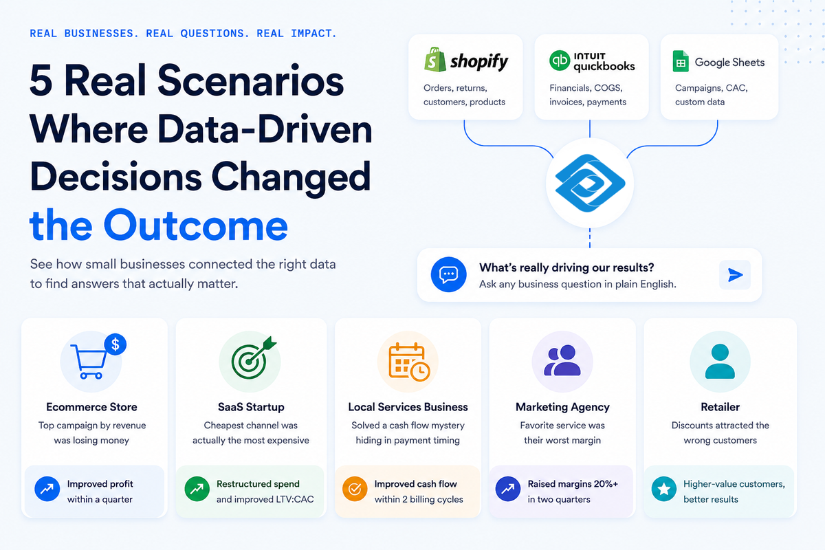
The five scenarios below are realistic hypotheticals - composites of the kinds of questions small businesses actually ask when they get serious about their data. Each one shows the specific question, the data sources involved, and what the answer changed. These are the types of businesses that are probably familiar to you - not Netflix, not Amazon, not Starbucks.
Key takeaways
- Business questions often require multiple data sources. Data-driven decisions at small businesses frequently depend on connecting information from two or more systems. The answer is usually available, but the challenge is that the data lives in different places.
- Revenue alone doesn't tell the full story. Revenue is one of the easiest metrics to track, but it provides limited context on its own. Profitability, margins, and customer lifetime value reveal different aspects of business performance.
- The best questions focus on causes, not just numbers. The most valuable insights come from understanding why performance changes, not simply what the metrics are. Answering those questions typically requires combining data from multiple tools and systems.
The ecommerce store that found its best campaign was losing money
A Shopify store owner connected Shopify to QuickBooks to measure true campaign profitability - accounting for cost of goods sold (what they paid to produce or buy what they sold, or COGS) and product returns alongside revenue. Their top-performing campaign by revenue turned out to have the worst actual margin, because the products it sold had high return rates and thin margins. Cutting that campaign's budget in favor of a lower-revenue, higher-margin campaign improved total profit within a quarter.
Before connecting the two tools, the number they had been optimizing for was gross revenue. The number that actually mattered was net margin after returns and COGS. You can't see the difference when revenue lives in one tool and cost data lives in another.
The best campaign by revenue had the worst margin because that product category had high return rates. Customers loved ordering it, but a significant percentage sent it back. The inventory cost plus return shipping erased the profit. Meanwhile, a smaller campaign that barely registered by revenue was selling their highest-margin product to customers who almost never returned it.
They cut the budget on the revenue winner and tripled it on the margin winner. Total profit improved within a quarter even though total revenue was slightly lower. The question wasn't complex. The answer had always been there.
The software startup that discovered its cheapest channel was actually its most expensive
A 15-person SaaS startup was doing what every growth-stage team does: comparing customer acquisition cost (CAC) - how much they spend on average to win one new customer - across channels. Paid search through Google Ads looked expensive at around $340 per new trial. Organic search looked cheap at around $90.
On those numbers alone, the instinct was to shift budget toward content and SEO, away from paid search.
Before they made the change, they pulled their subscription data from their billing platform and cross-referenced it against acquisition source for every customer over the past 18 months. What they were looking for was customer lifetime value (LTV) - how much revenue a customer generates over the full time they stay with the business.
Paid search customers churned about 40% faster than organic customers. Against $3,100 LTV for organic customers, organic acquisition at $90 CAC spent around three cents per dollar of lifetime revenue. Paid search at $340 CAC against $1,800 LTV spent about 19 cents. Organic was genuinely more efficient.
But the data also showed something unexpected: paid search customers who came in searching for specific feature terms - not generic category terms - had LTV nearly equal to organic customers. The expensive channel was expensive when targeting broad intent. It was competitive when targeting specific intent.
The startup didn't abandon paid search. They restructured it. And they only knew to do that because they'd put acquisition data and retention data in the same place.
The local services business that solved a cash flow mystery
When a home services business combined QuickBooks invoice data with scheduling records, they found commercial clients paid invoices 47 days after issue, while residential clients paid in under a week. Commercial work had grown to 60% of revenue. Cash flow felt tight not because the business was unprofitable, but because most of its revenue was tied up in accounts receivable for six weeks at a time.
The business had been growing steadily for two years. Revenue was up. The owner had added staff. But the cash flow problem didn't match the growth story - and the owner couldn't figure out why.
The accountant was using QuickBooks for invoicing. The business ran a separate scheduling platform for job bookings. Neither system had ever talked to the other. Once the data was connected, the pattern was immediate: commercial clients - property management companies, office buildings - took 47 days to pay. Residential homeowners paid in under a week. That difference, multiplied across 60% of revenue, meant most of the business's money was perpetually tied up waiting.
Adjusting payment terms for commercial clients - requiring deposits and shortening net payment windows - resolved the cash flow gap within two billing cycles. The revenue didn't change. The timing did.
The agency that found out its favorite service was its worst margin
An eight-person marketing agency was healthy on paper - profitable, good client relationships, a solid mix of retainer and project work. But some months felt harder than others - the team was busy, the invoices went out, and the quarterly numbers still didn't reflect the energy being put in.
The owner ran a project-level profitability analysis using QuickBooks data alongside the project management tool where the team logged hours. The question was: what is the actual margin per project type, once you account for hours actually worked versus hours quoted?
Their most popular service type - the one the team genuinely enjoyed, the one they led with in pitches - had the worst margins. Scope creep (when a project expands beyond what was originally agreed, without extra payment) was absorbing an average of 30% of billable hours on every project of that type. The team quoted based on what a smooth project looked like. The projects were rarely smooth.
Their least popular service had the best margins. It was well-defined, the deliverables were clear, and the team had done it enough times that they rarely ran over.
The agency didn't stop selling the popular service. They rewrote the statement of work, added explicit out-of-scope clauses, and raised the price by 20% to reflect actual delivery time. Within two quarters, that service was no longer a margin drag.
The data was in QuickBooks. The hours were in the project tool. The profitability picture required both.
The retailer whose discount promotion attracted the wrong customers
A 12-person specialty retail shop ran a 20%-off promotion on their most popular product line. The thinking was straightforward: reward customers, drive volume, move inventory. The team assumed their best customers - the regulars who bought at full price - would be most likely to respond.
They measured results by connecting their point-of-sale (POS) data to their email marketing platform and segmenting post-campaign buyers by lifetime value tier. High-value customers had made at least four purchases in the previous 12 months. Mid-value customers had made two or three. Low-value customers had made one.
The discount overwhelmingly attracted low-value customers. High-value customers - the people who drove most of the store's annual revenue - bought at roughly the same rate as they had in the weeks before the promotion. They were going to buy anyway. The discount just reduced the margin on purchases they would have made regardless.
The mid-value tier barely moved. The campaign hadn't converted the middle segment into more frequent buyers.
The shop shifted strategy. Blanket discounts gave way to exclusive early access for high-value customers. For mid-value customers, they ran targeted offers designed to drive a second or third visit - the behavior that actually predicts longer-term loyalty.
None of that was possible without knowing which customers were which. The POS had the transaction history. The email platform had the engagement data. The question required connecting them.
What these five scenarios have in common
Each of these five data-driven decisions required connecting two sources that were previously separate - revenue plus cost data, acquisition plus retention data, booking types plus payment timing, project hours plus financial results, transaction history plus customer segments. In every case, the data existed in tools the business already used. The business question was answerable. The problem was that the relevant data lived in different places, so the complete question had never been asked.
Once these teams had the full picture, the decision wasn't particularly hard. The ecommerce store didn't need a six-week analysis to cut the losing campaign. The local services business didn't need a consultant to explain why cash flow was tight. The answer was obvious as soon as the data was in the same place.
If your key business questions feel hard to answer, it's worth asking whether the difficulty is the question or the data. Often the question is straightforward. The data just isn't connected yet. For more signs that your current setup might be holding you back, see five signs your spreadsheet setup isn't working anymore.
What to do next with AnalysisGPT if your data lives in separate places
The most direct fix is connecting the sources and asking the question you actually need answered. That's what each of the businesses above eventually did - and in most cases the path didn't require a data engineer or a custom dashboard.
Conversational analytics platforms let non-technical teams connect multiple tools and ask business questions in plain English - no SQL (a programming language used to query databases), no ETL pipeline (an automated process that moves and reformats data between systems), no dashboards to build. You connect your tools, ask the question, and get an answer.
AnalysisGPT is one example. It connects directly to Shopify and QuickBooks - the integrations are live - and lets you ask questions like "which campaigns were profitable after returns and COGS?" or "what's my average payment collection time by client type?" without writing a query or exporting a spreadsheet. The platform's architecture means the LLM only sees your column fields and table metadata, never the underlying data, so your business information stays in your own systems.
If you want to see what your data looks like when it's connected, you can review more options in this roundup of best analytics tools for small business teams.